Ever wondered how to create impactful visuals for your pitch or social? In our last post, we talked about how PR professionals are now expected to create polished visuals — often without a designer, and how new easy-to-use tools are stepping in to help fill that gap.
If that post was the “what and why,” this is the “okay… but what do I actually use when?”
Because let’s be honest — having options is great, but it can also slow you down if you’re not sure which direction to go.
So, here’s a simple way to think about it.
Your Core Tools (And Where They Fit)
🟣 Canva
Still the go-to for a reason.
- Drag-and-drop design
- Templates for just about everything
- Built-in access to Pexels and Pixabay image libraries
When you’ll reach for it:
Everyday visuals—social posts, quick graphics, event promos, anything you need to turn around fast and keep on brand.
🟠 Piktochart
This is where things get a bit more strategic.
- Built for infographics, reports, and data storytelling
- Helps turn information into something people can actually understand
When you’ll reach for it:
Thought leadership, research summaries, internal decks, or anytime you’re trying to explain—not just promote.
🔵 Snappa
Fast and simple by design.
- Minimal learning curve
- Quick output
When you’ll reach for it:
Social graphics or last-minute needs when you just need to get something out the door.
The Image Side of the Equation
Even the best-designed layout can fall flat if the image doesn’t work.
That’s where image libraries come in—they’re doing a different job, and it’s an important one.
📸 Getty Images / iStock
- High-quality, editorial-style images
- Widely used across media
Best for:
Press kits, announcements, anything high-visibility
How to think about it:
When credibility really matters, this is usually the safest bet.
🎨 Freepik
- Vectors, graphics, templates
- More flexibility to customize
Best for:
Enhancing designs or building something a little more tailored
🌿 Unsplash
- Free, high-quality photography
- More natural, less staged feel
Best for:
Blogs, social, thought leadership
How to think about it:
When you want something that feels a little more real and less “stock.”
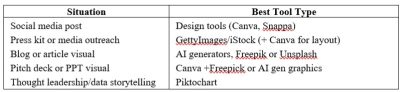
So… What Should You Use When?
Here’s the quick mental shortcut:
What This Looks Like in the Real World
Most PR teams aren’t using just one tool—and you don’t need to either.
A pretty typical workflow might look like:
- Start with a template in Canva
- Pull in an image from Unsplash or Getty
- Use Freepik elements if you need to customize
- Or build something more data-driven in Piktochart
That’s it. Nothing overly complicated—just using each tool for what it’s good at.
A Quick Reality Check
You don’t need to master all of this overnight.
The expectation that PR pros can now write, pitch, and design can feel like a lot (because it is). But this is one of those areas where the tools really do make it easier.
Once you find a few that work for you, things start to click, and you spend a lot less time staring at a blank slide wondering where to start.
Tool School Takeaway
If you’re building your go-to toolkit:
- Start with Canva for everyday design
- Use Piktochart when you need to communicate something more complex
- Keep Snappa in your back pocket for speed
- Layer in image libraries depending on the level of polish you need
The advantage isn’t just having access to these tools, it’s knowing when to use each one.
Make this easy on yourself … if you want to explore more options without spending hours researching, PRToolFinder organizes all of these tools into one category – see what else is out there that will help you save time!